Gallery by Grimshaw
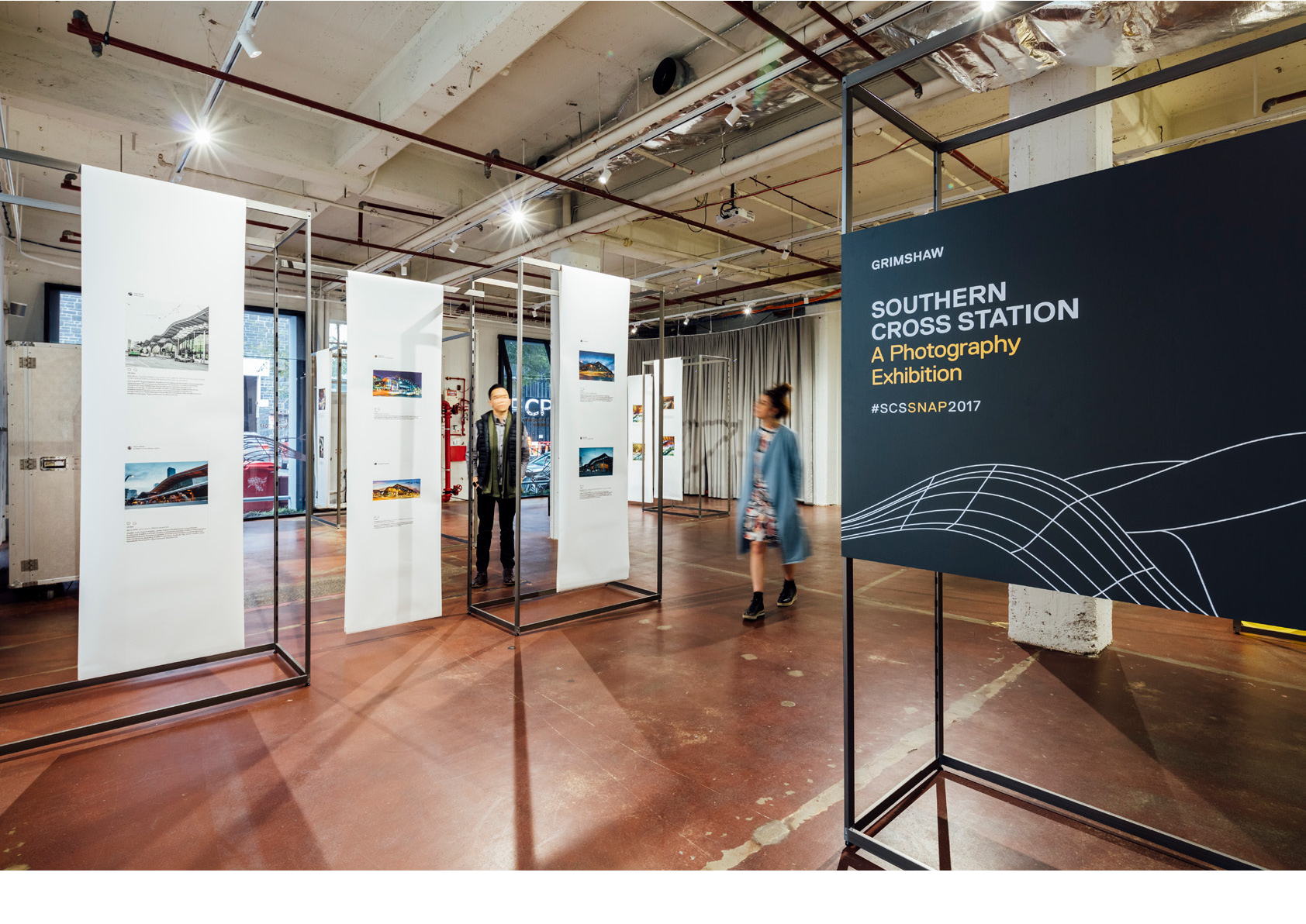
Grimshaw Architects (Melbourne) required an identity and brand concept for their ground-level gallery space, housed in an industrial warehouse. The Gallery will be used for a wide range of talks, events and exhibitions. The ethos of the gallery is one of inclusiveness and cultural offering. It used across multiple disciplines and purposes and not from a particularly architectural one.
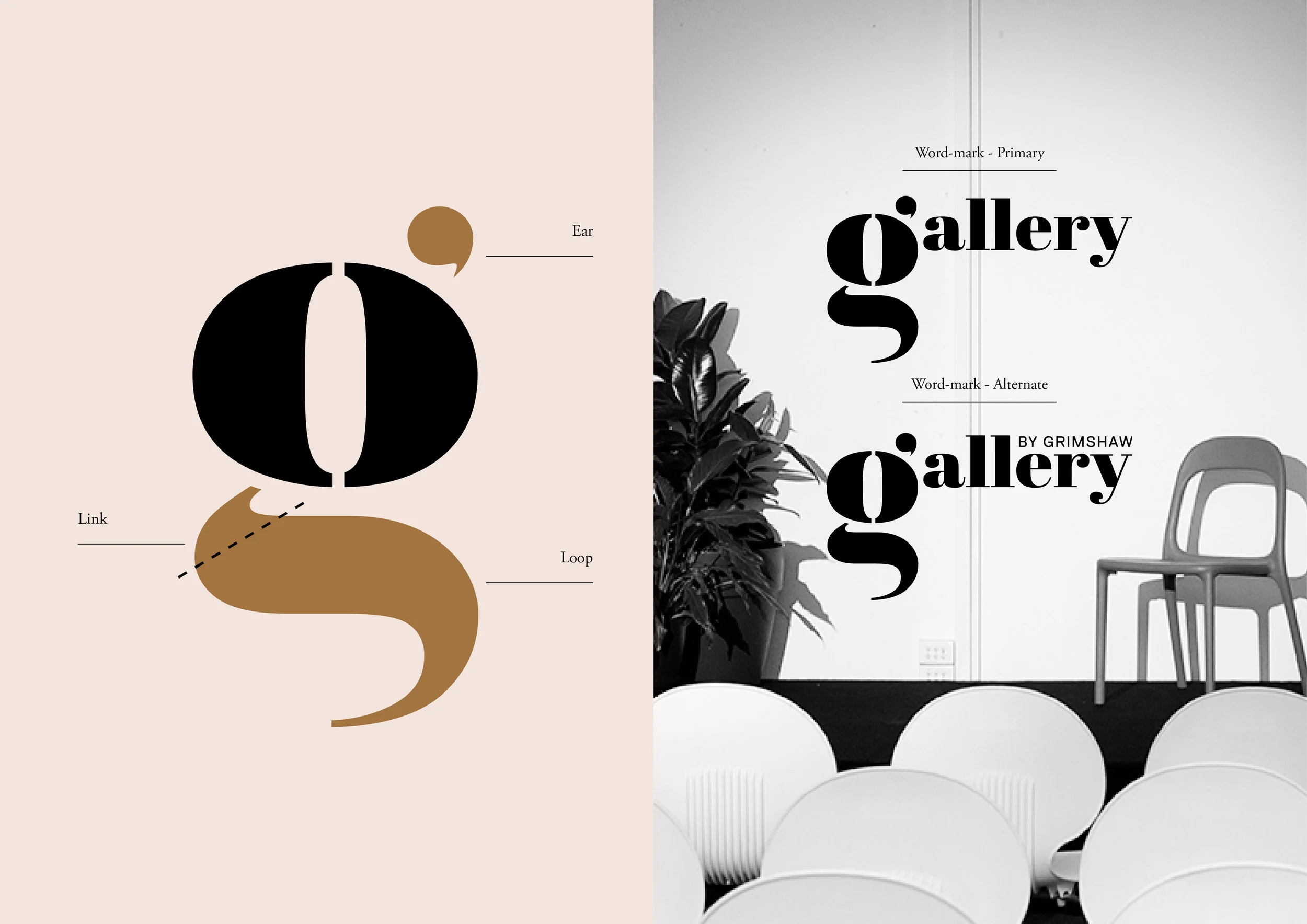
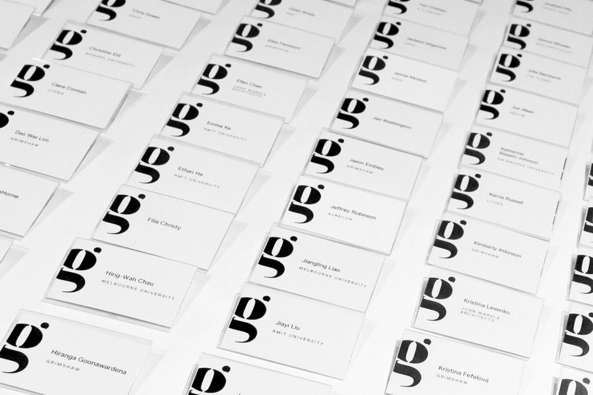
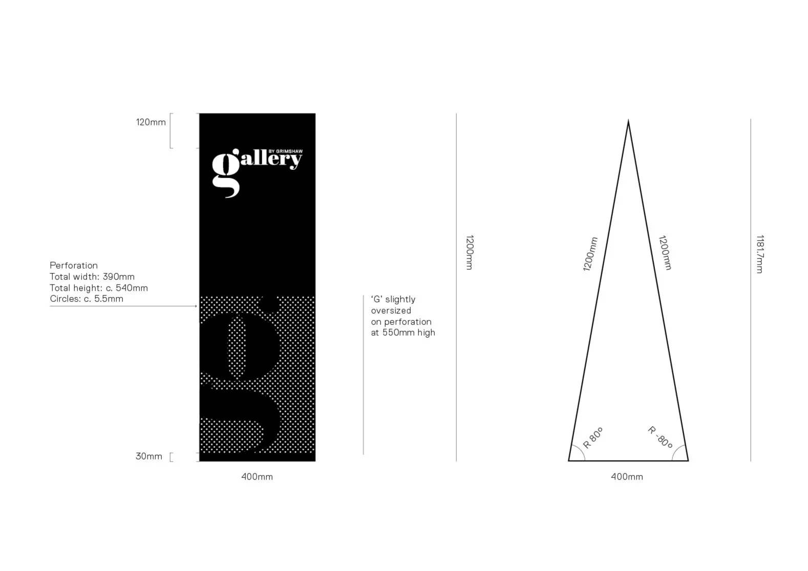
The logo design has its own identity and compliments the Grimshaw brand. The identity is based on themes that exemplify the Gallery’s aspirations and ambition. The logo is a lower-case G referencing the Gallery (its name) and Grimshaw as its provider. The logo has a bold, but inclusive design. Based on the brand themes and aspirations the logo demonstrates a personal and approachable feel with the G taking on an overall human form.
The logo takes on both a sans serif and a serif G without the usual flourishes. It is not rigid or architectural, but instead feels open and cultural. The ‘ear’ of the G references both listening and talking (quotation mark), the lower part of the G contains typographic elements the ‘loop’ and the ‘link’ for storytelling and learning in a non linear fashion.
The optional word-mark is applied when listing sponsors / supporters on branded collateral. The word-mark includes an ‘alternate’ with the words “By Grimshaw” for use on externally sponsored events (not ran by Grimshaw).
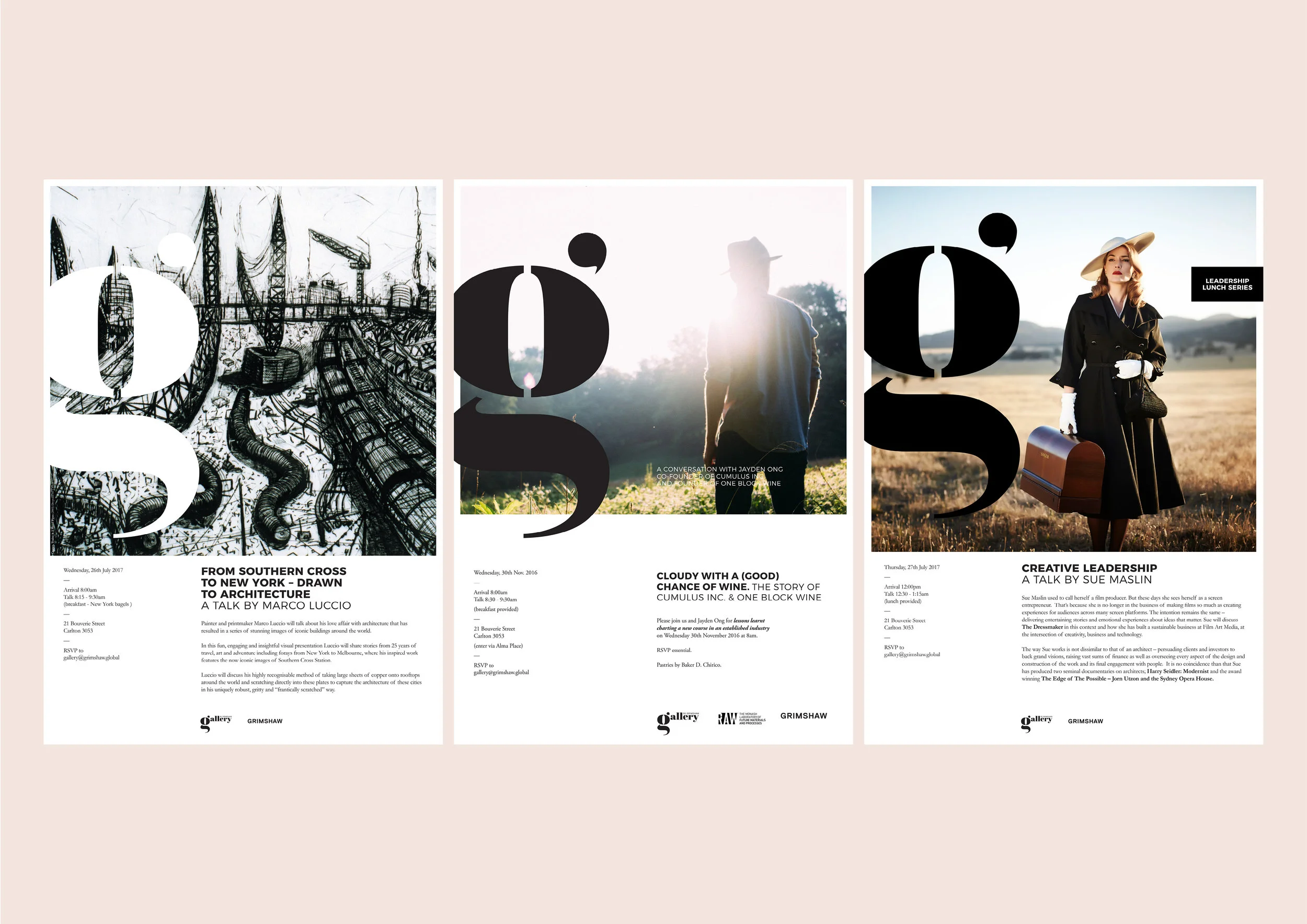
The Gallery’s simple colour palette is applied with emotive imagery and strong typography to convey a sense of boldness and ensure that each event stands on its own.

