Inpack
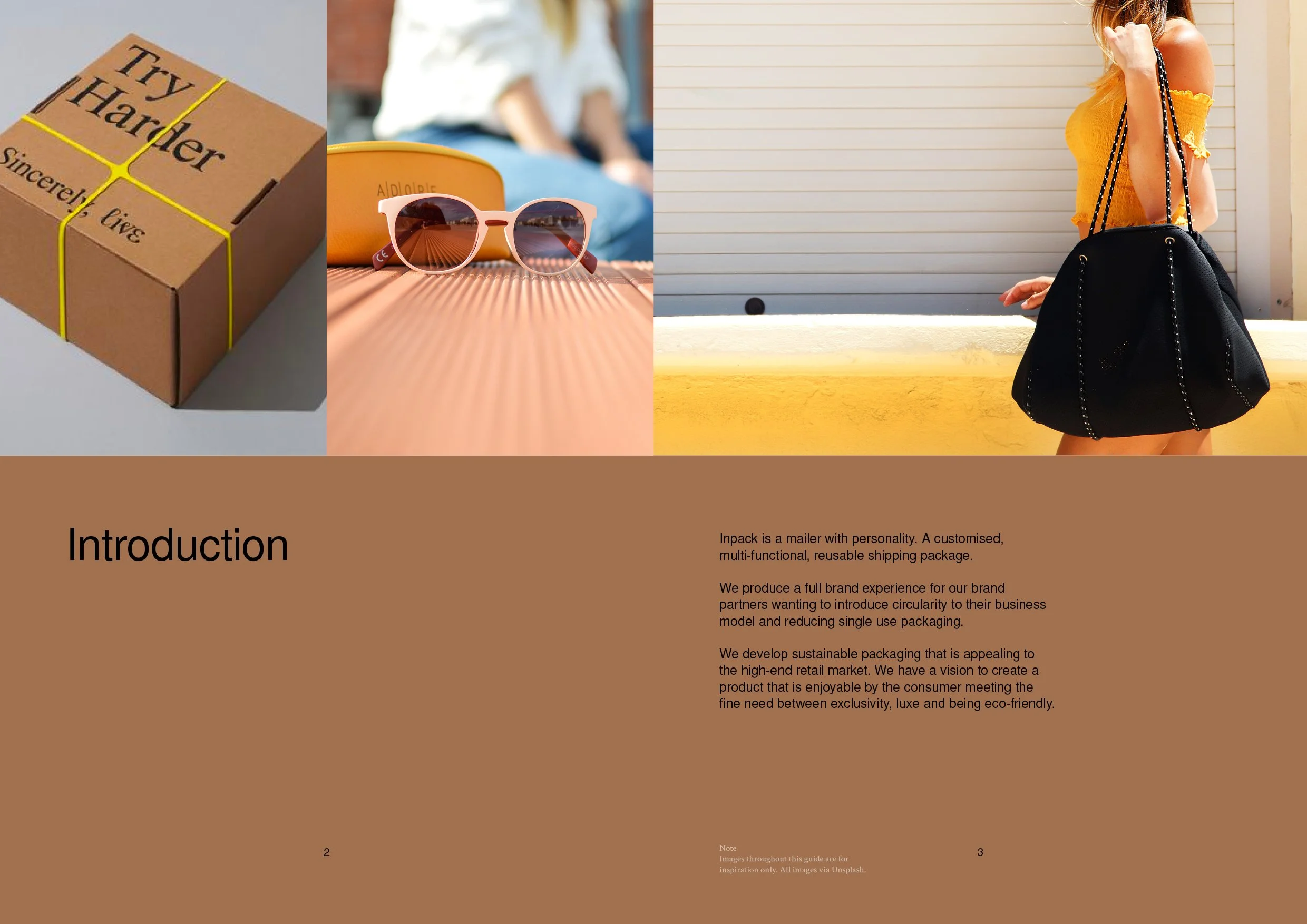
Inpack epitomises a mailer with distinctive character—a branded, customised, and versatile postage package designed for sustainability. It serves as a comprehensive brand experience, particularly for businesses aiming to integrate circularity into their model while minimising single-use packaging.
Inpack focuses on crafting sustainable packaging tailored to the high-end retail sector. The goal is to establish a shipping package that not only resonates the brand but is also instantly recognisable to consumers. The approach strikes a balance between exclusivity, luxury, and eco-friendliness.
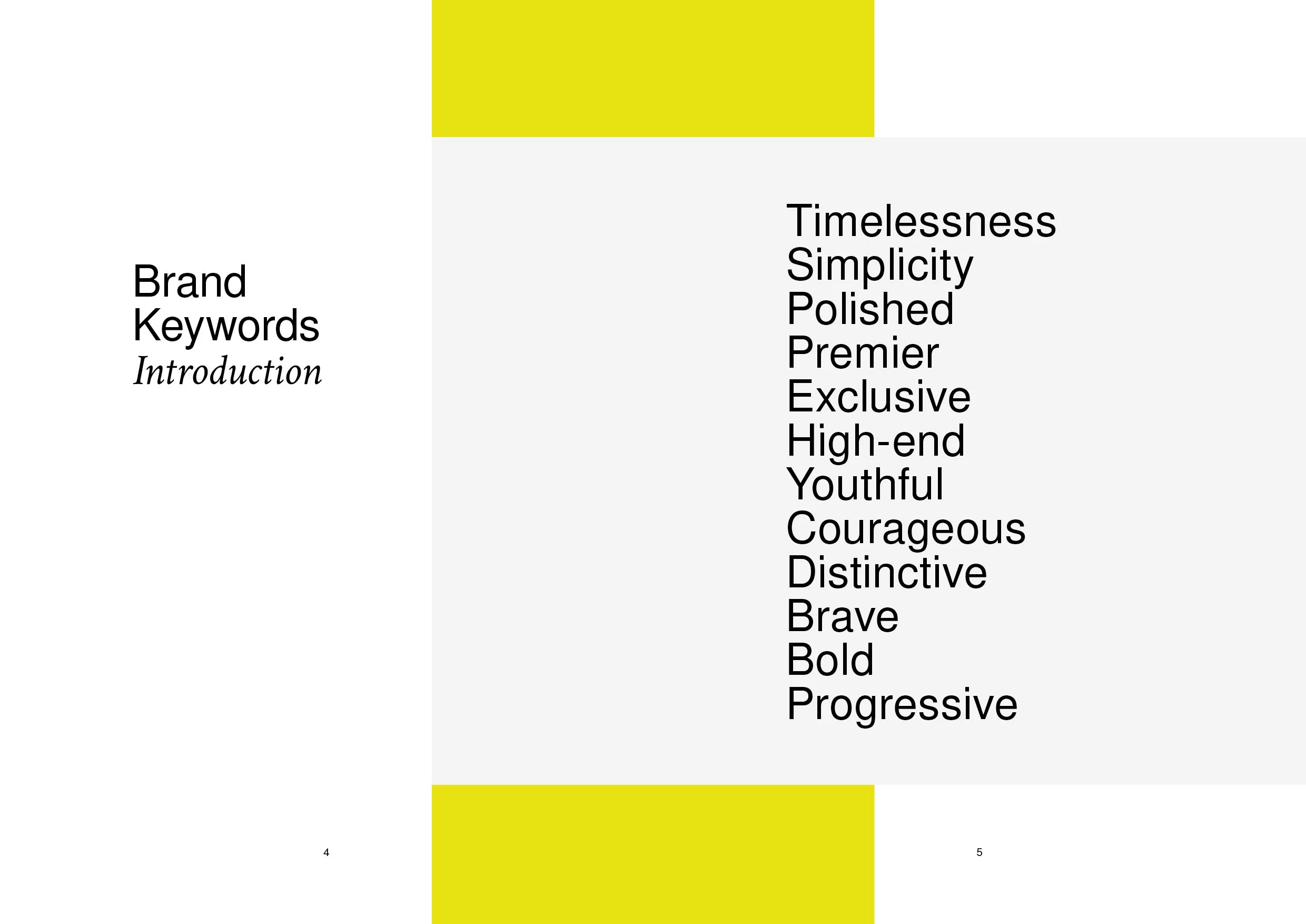
Inpack aspire for:
Timelessness
Simplicity
Polished aesthetics
They strive for:
Premier positioning
Exclusivity
High-end appeal
Yet embrace boldness with:
Courage
Distinctiveness
Bravery
Our role involved shaping the brand identity for Inpack, facilitating its launch, and introducing it to the world. To achieve this, we’re dedicated to creating key elements that differentiate Inpack from competitors, establishing a visual identity, and setting the brand tone.
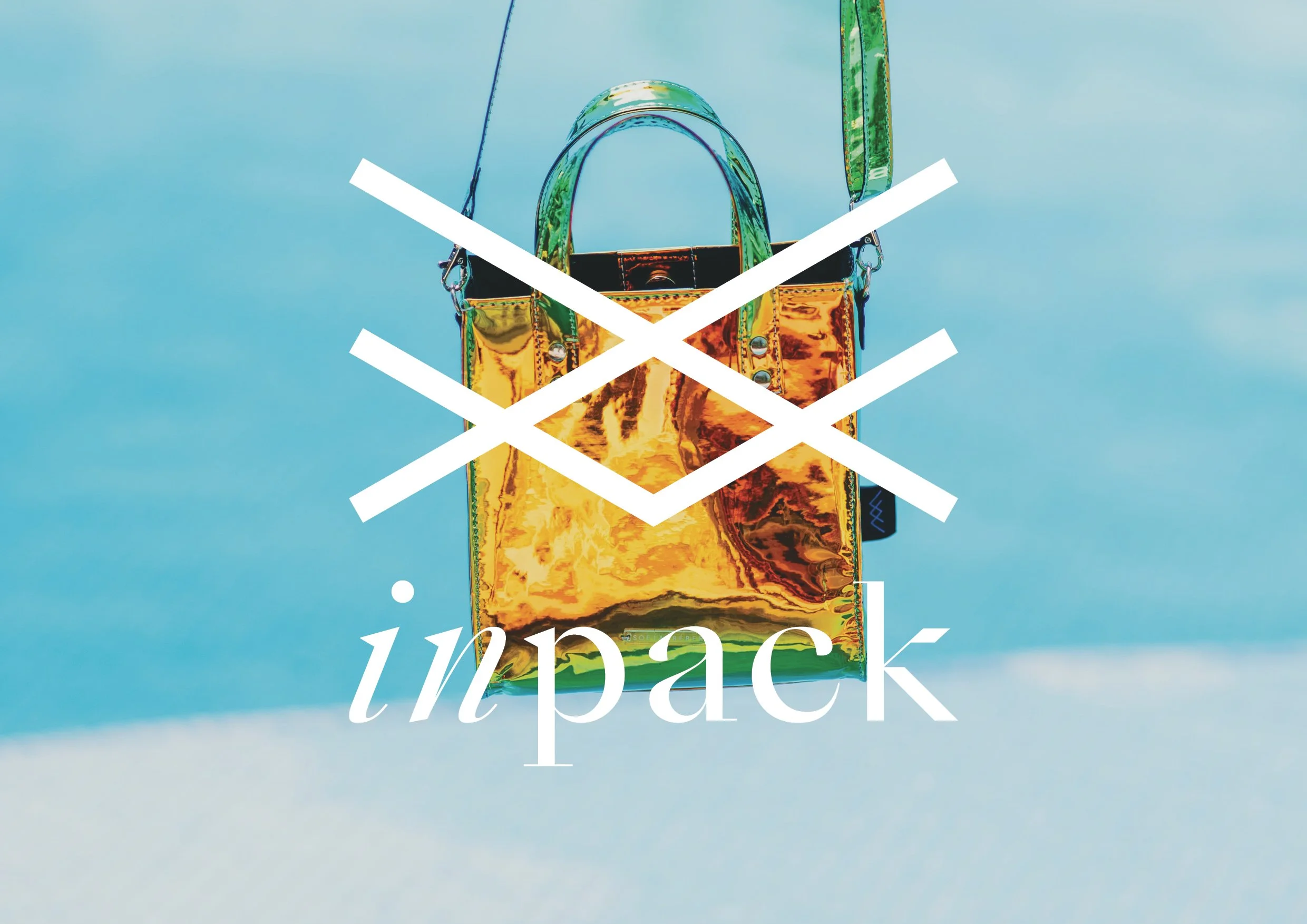
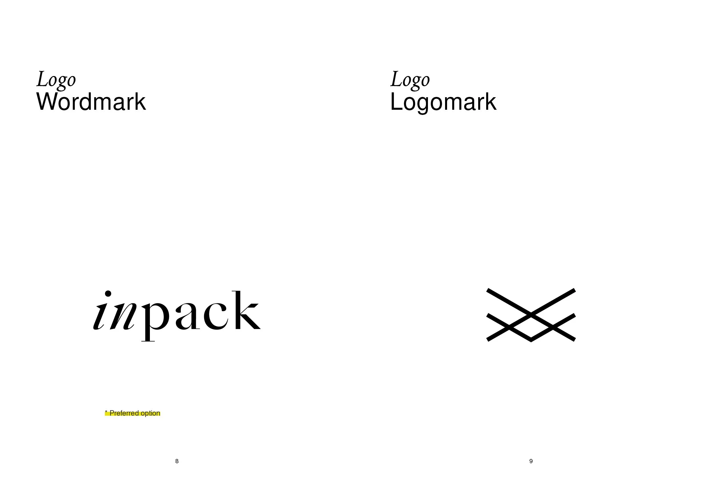
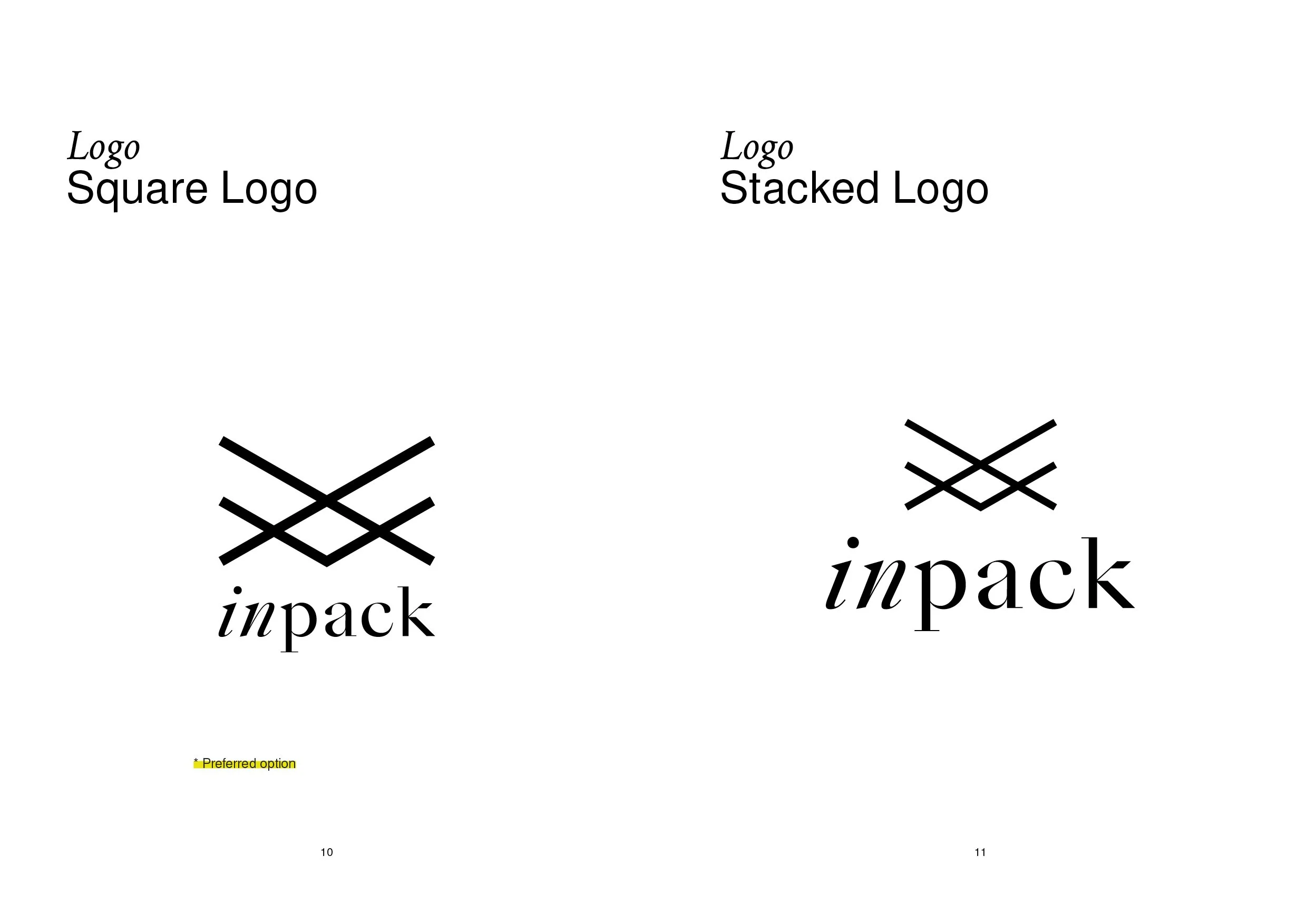
Logo: Dynamic and structured, mirroring the client brand’s postage mailer. The folded elements of the icon draw inspiration from packaging design. The logo is versatile for various communication methods; digital, social media, print, and web. Ensuring easy recognition and eye-catching appeal.
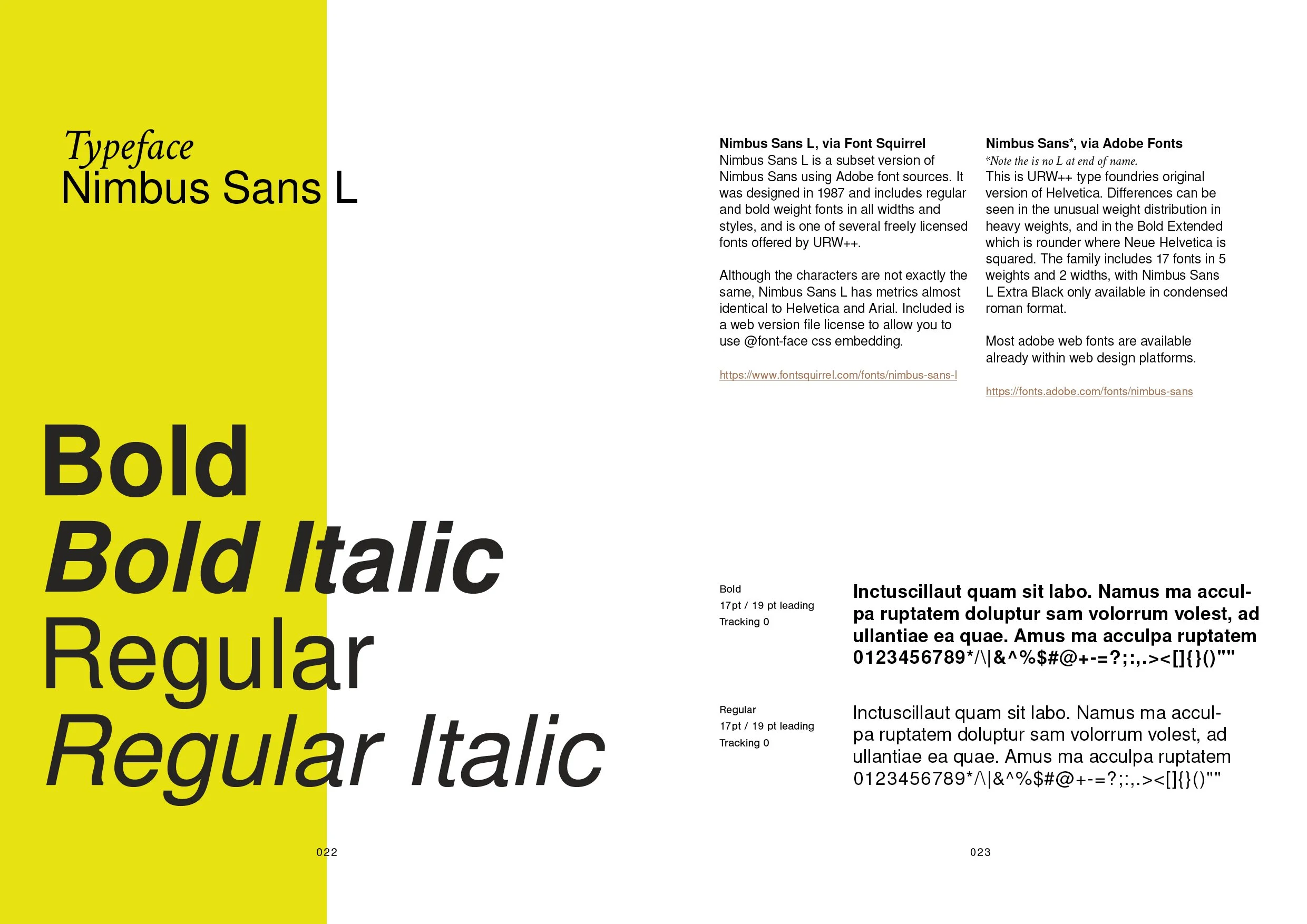
Typography: Tailored to the context brief while complementing the new logo design.
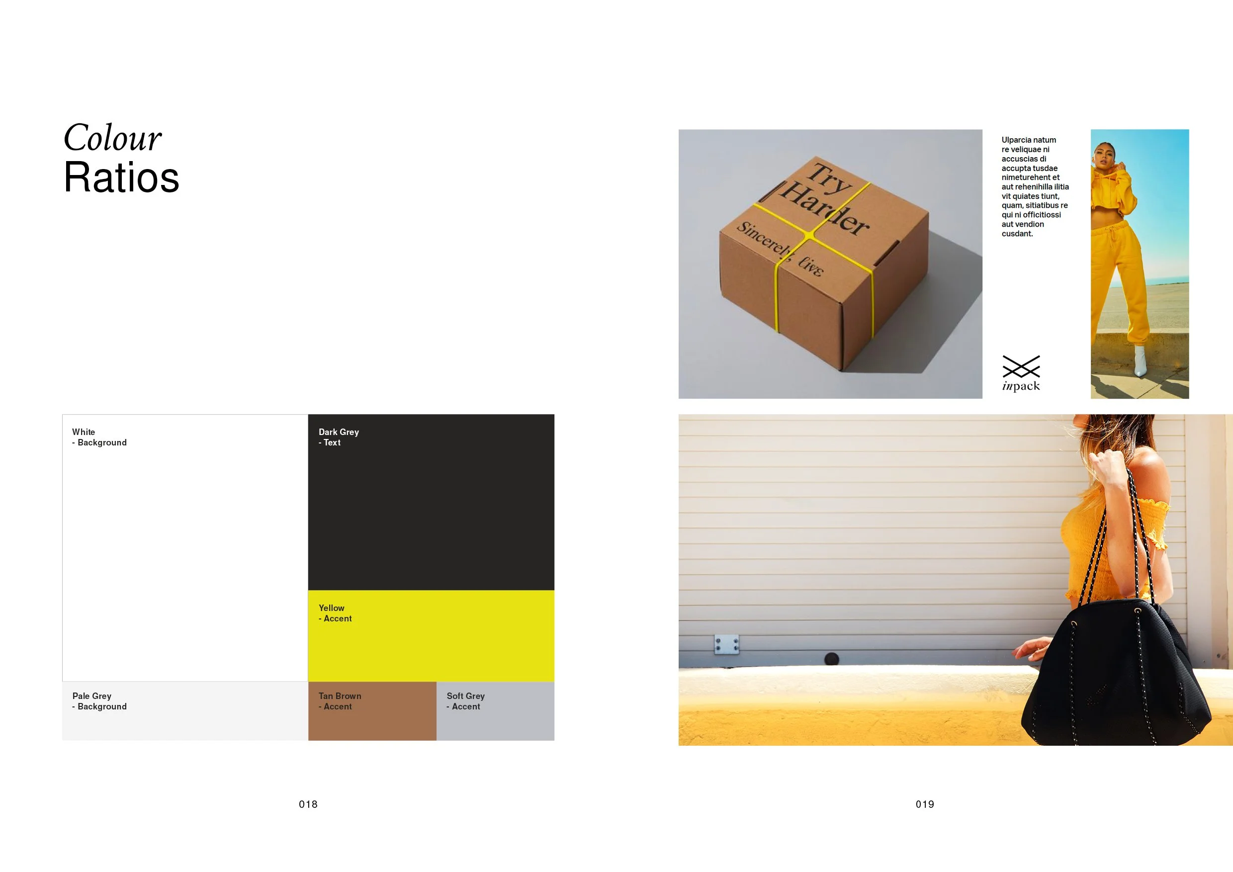
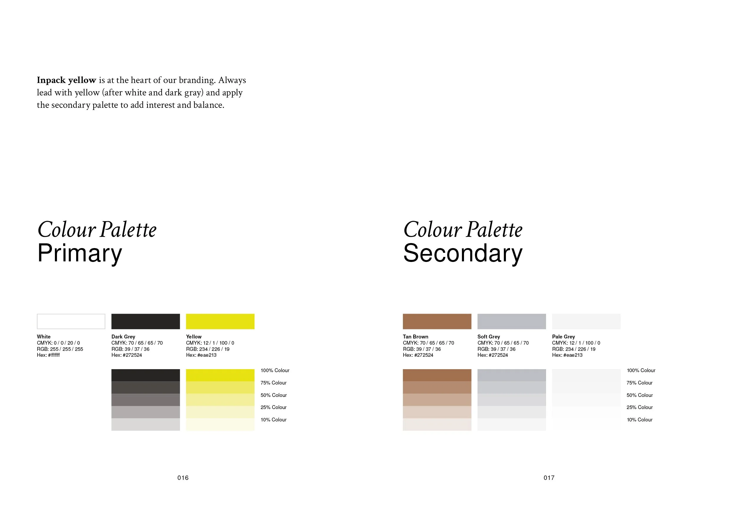
Colour palette: Playing a pivotal role in brand identity, the palette exudes a youthful and bold vibe, aligning visuals with the brand ethos.

