Melbourne Airport Design Vision
Since its opening in 1971, Melbourne Airport’s terminal campus has expanded in an adhoc fashion resulting in an uncoordinated and disjointed building, with a mishmash of design aesthetics and design influences.
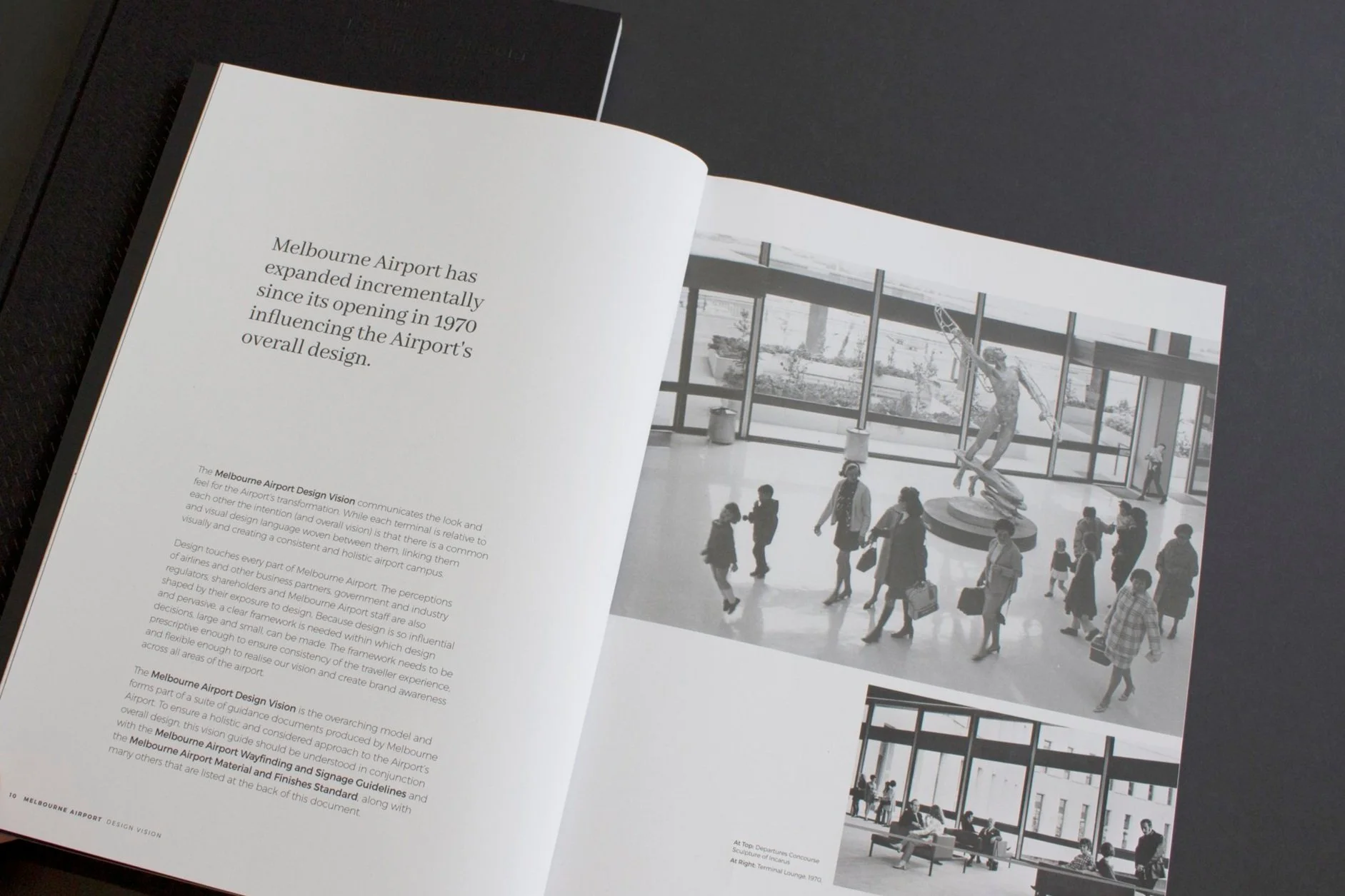
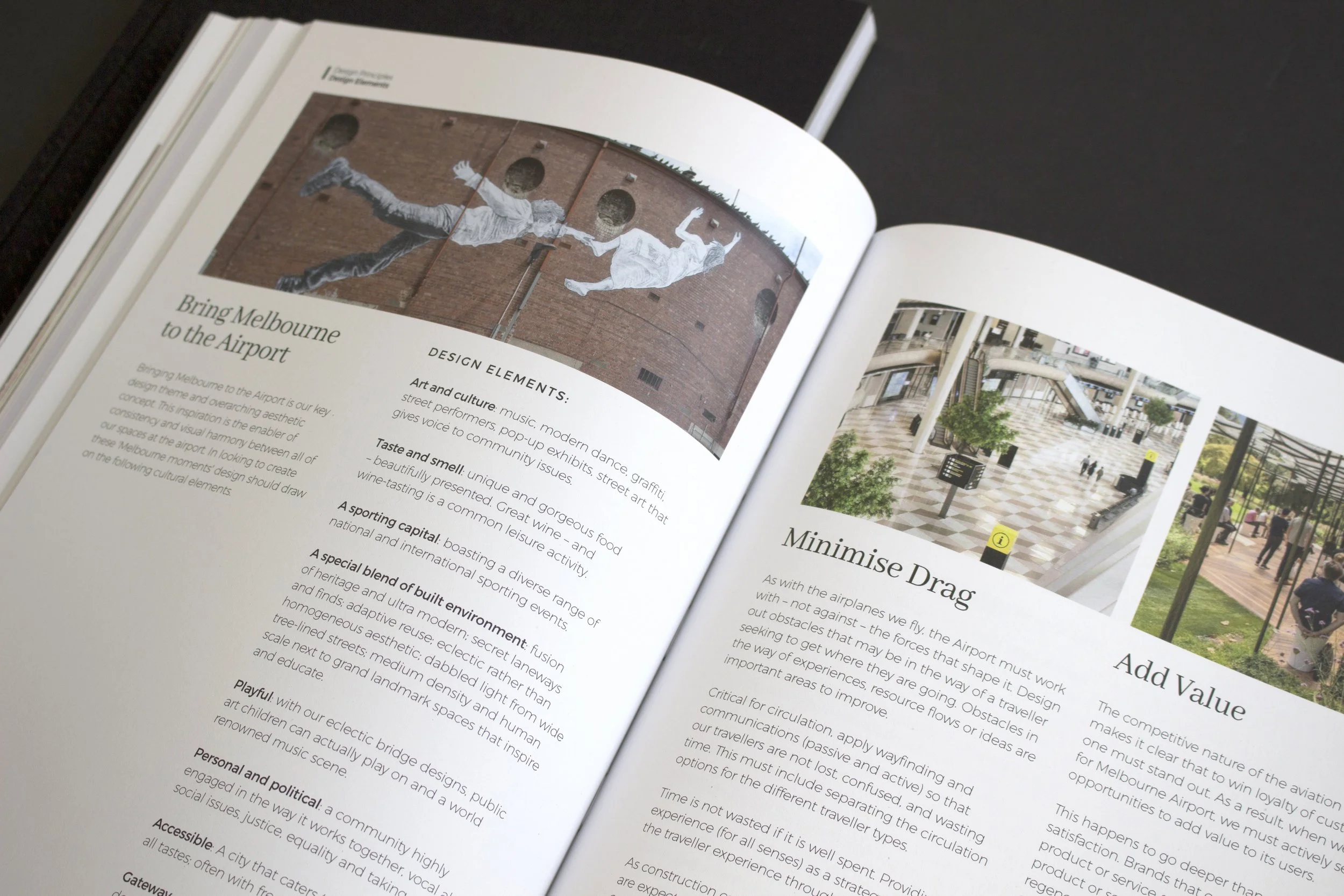
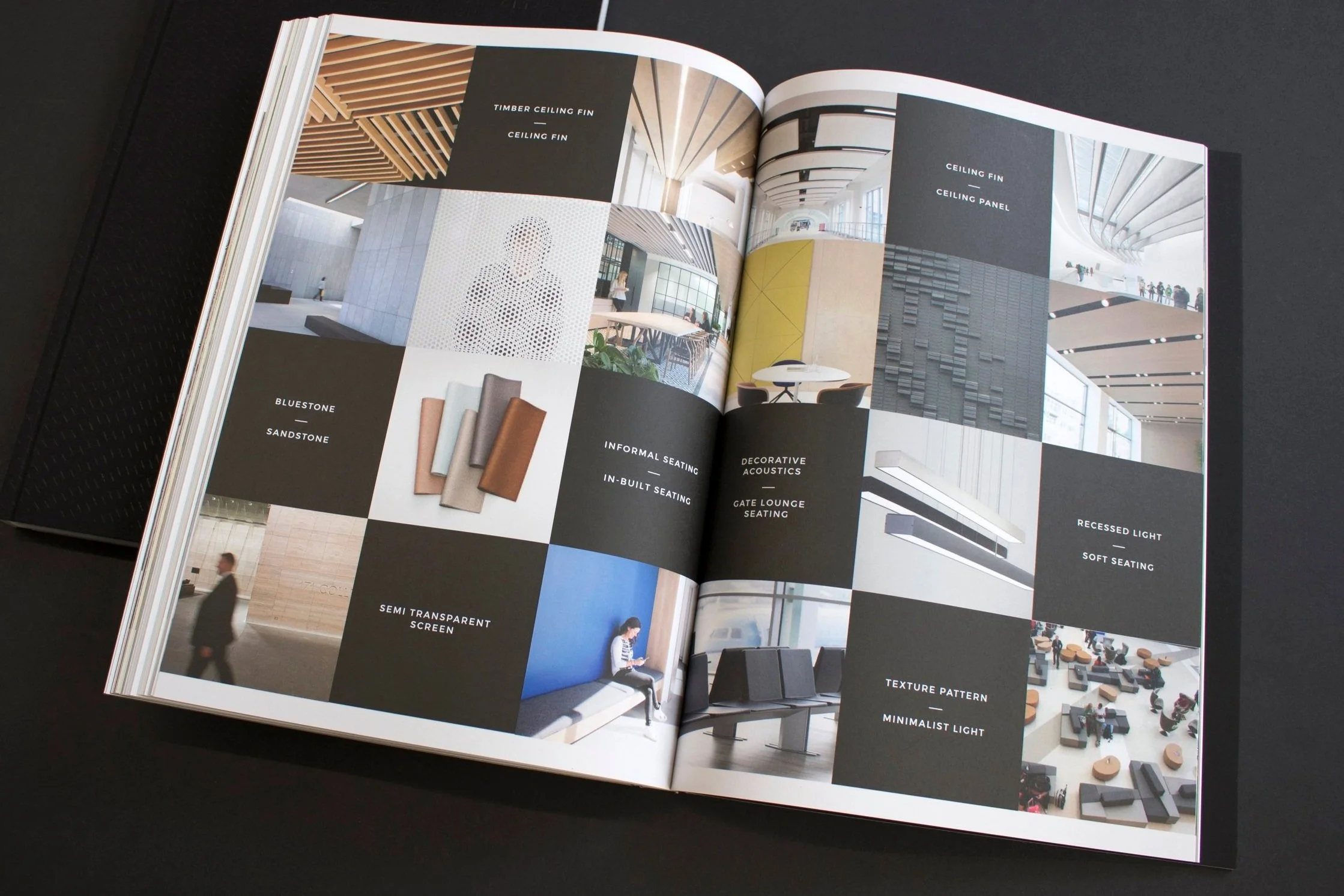
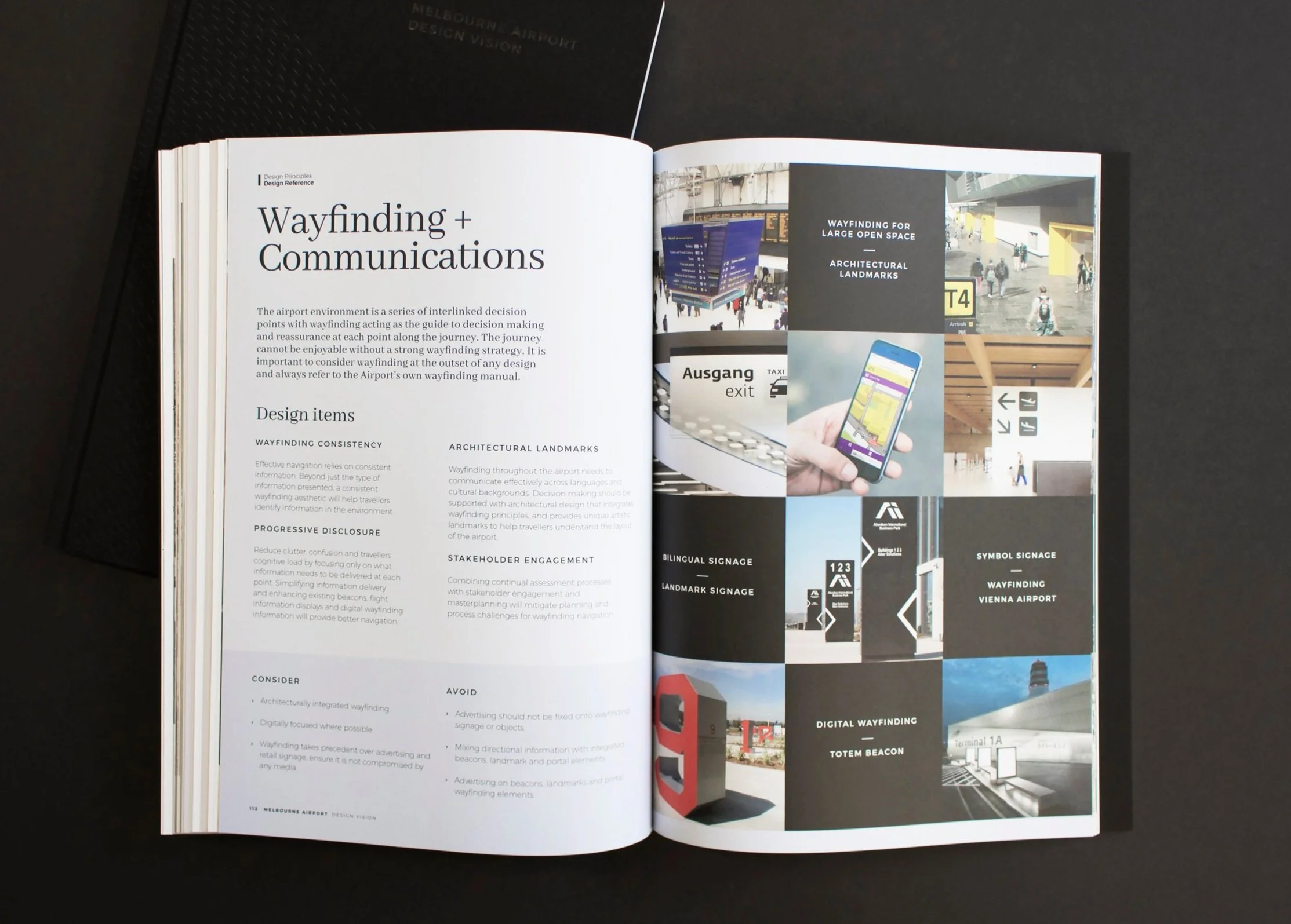
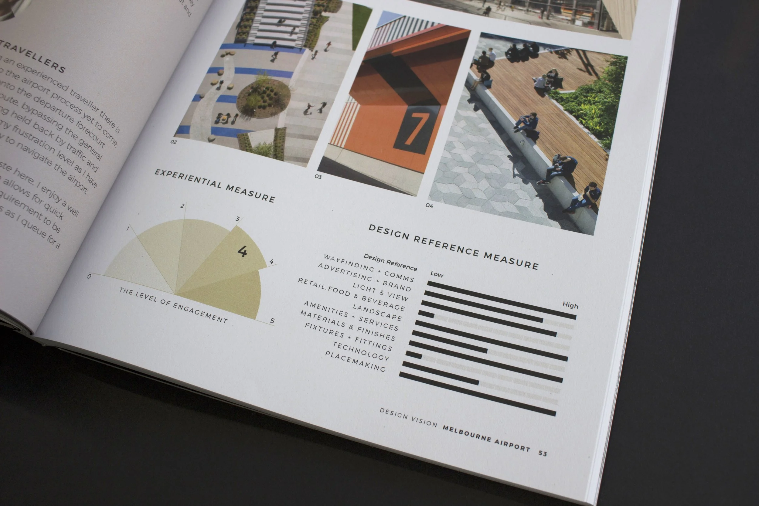
The Melbourne Airport Design Vision sets out design principles for architects, designers and Melbourne Airport staff towards a united vision that will transform the airport and improve user experience. The Design Vision informs and inspires the reader on Melbourne Airports’ unique perspective and enables others to evaluate design proposals on a more objective basis.
The intent of the guide is to connect travellers and visitors to Melbourne’s vibrant and culturally rich region as soon as they enter the airport. This can be in the way materials are used, local design aesthetic, or events and exhibitions on show. The Design Vision communicates the intended look and feel for the Airport’s transformation through best practice examples. It provides a framework that is prescriptive enough to ensure consistency of the traveller experience, but flexible enough to enable designers to realise the vision, and ultimately create a strong “Melbourne” brand across all touchpoints of the airport.
The Airport’s hope is that by understanding how all users engage with the airport campus and what makes Melbourne “Melbourne”; designers and architects will transform the terminal and realise the Airport’s vision of becoming “an airport Melbourne can be proud of”.
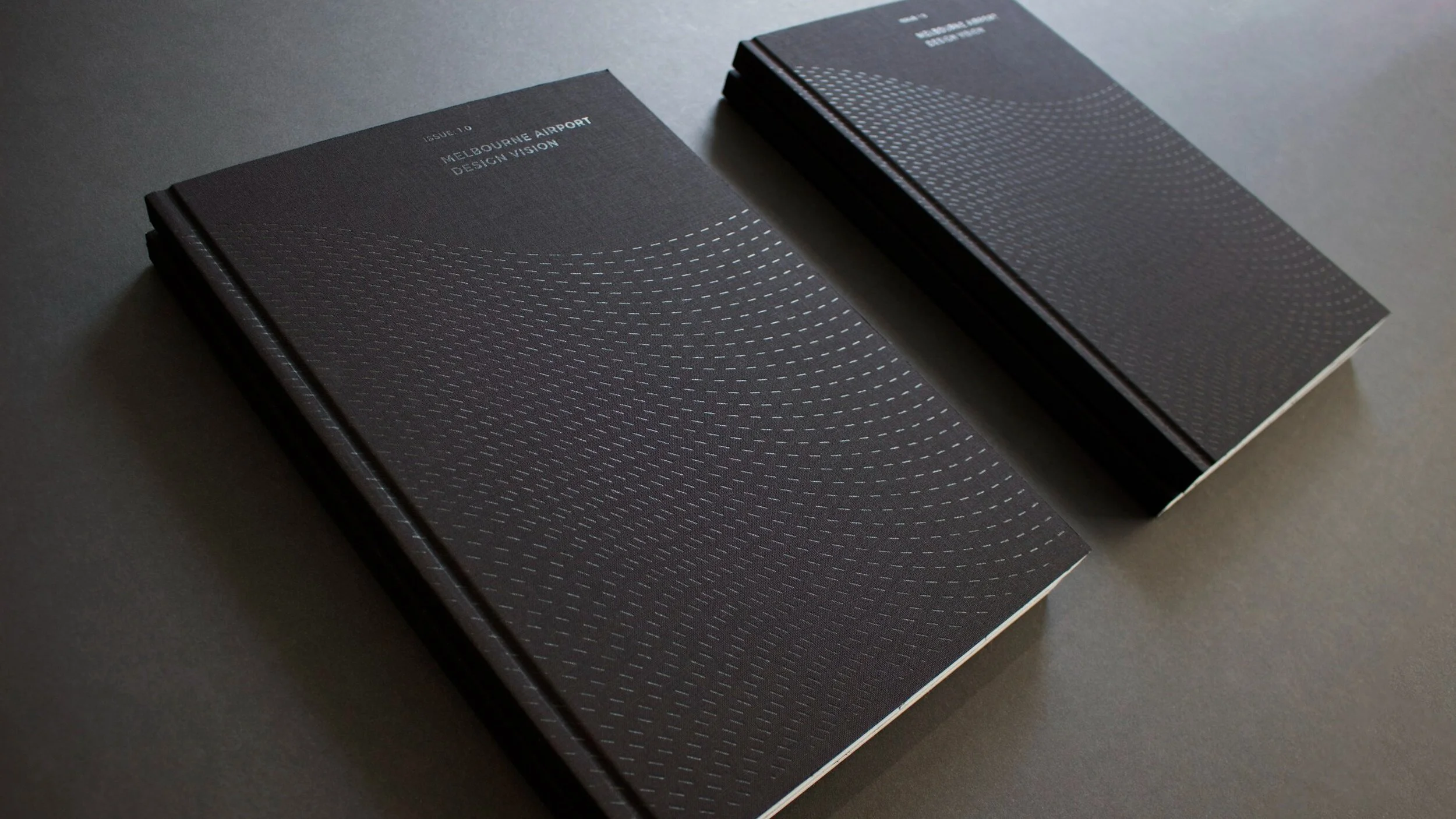
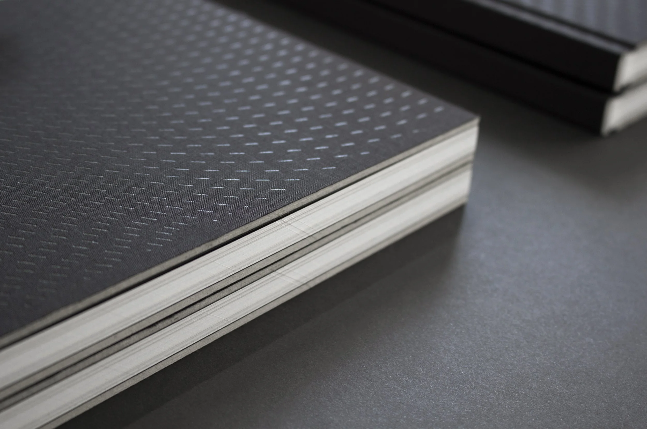
The cover design exemplifies the intent of the Design Vision by understanding who Melbourne is. We wear a “black uniform”, we are unfussy but sophisticated and edgy with a strong focus on design, art and culture.
Co-Writers: Marie MacGregor + Kristina Fefelova
Editor: Marie MacGregor
Photography: Marie MacGregor
Video Reel: Marie MacGregor
Sector
Retail / Cress Hire
Design Services
Brand Identity
EDM Design
Digital Design
Marketing Collateral
Presentation Design
Recognition
Finalist in the 2018 Premiers Design Awards, category: Design Strategy
Shortlisted for the 2018 AGDA Design Awards, in two categories: Identity + Manual and Entire Book Design.
Video reel of the Melbourne Airport Design Vision Book

